TACODELI
A recipe for growth.

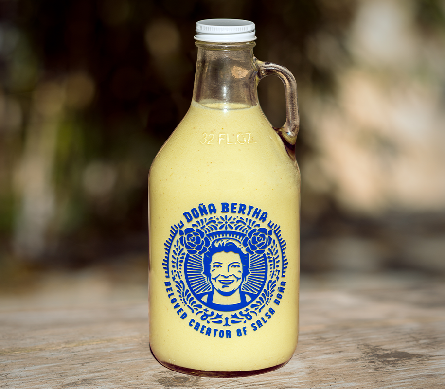
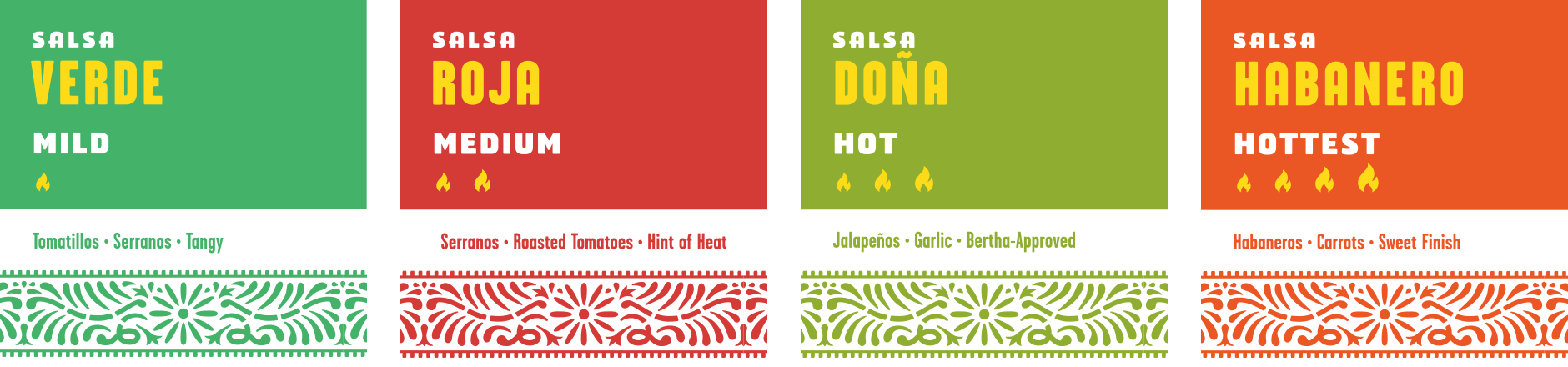
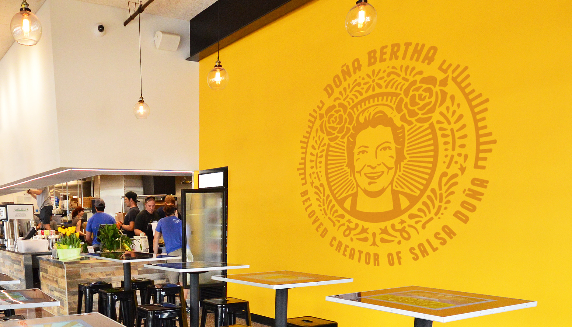
Tacodeli needed to refine their branding to support their growth into new markets outside of Austin. We embraced the quirkiness of their original wordmark while modernizing its style and improving legibility. The pattern and iconography were inspired by vintage Mexican ceramic tile. The new visual identity was used to update every customer touchpoint from menus to packaging to the website.
Strategy & Positioning
Narrative
Visual Identity
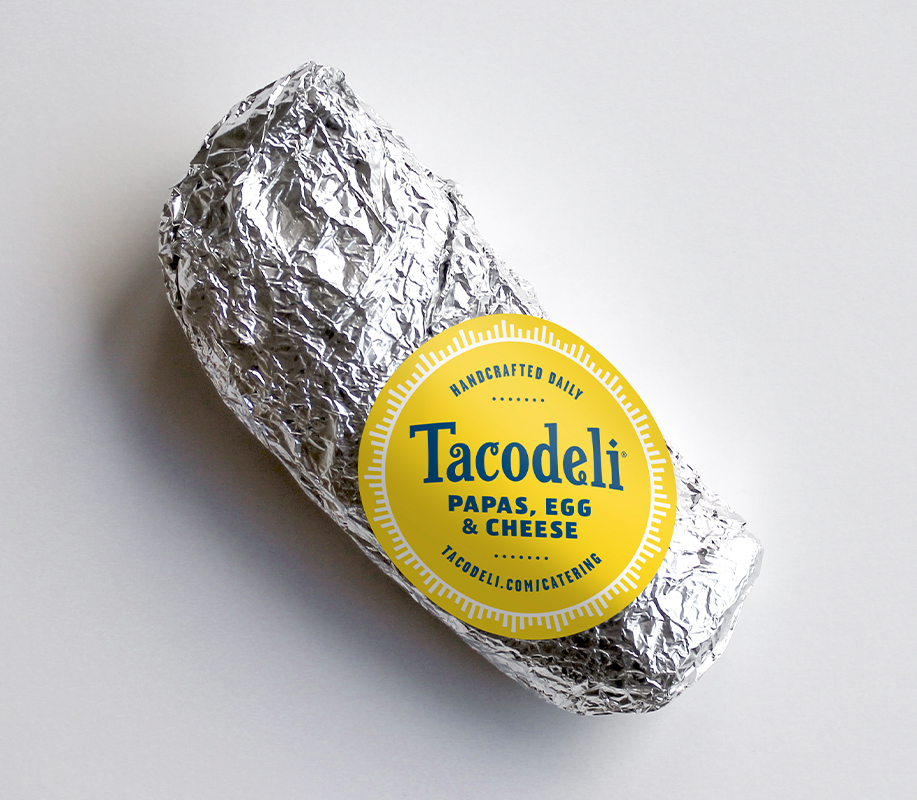
Packaging


SETTING THE TABLE
After spending a day blitzing with Tacodeli’s team, it was clear that they didn’t want or need a complete rebrand. They needed a way to refine and modernize without losing the equity and spirit of the original brand.