AUSTIN FC
Growing a legend.
CHALLENGE
Austin was the largest city in America without a major league sports team. We worked with the club that would change that. MLS research showed they needed to appeal to more than just soccer fans to be successful. So they came to us with a clear, yet ambitious goal: create a brand for all of Austin.
VALUE
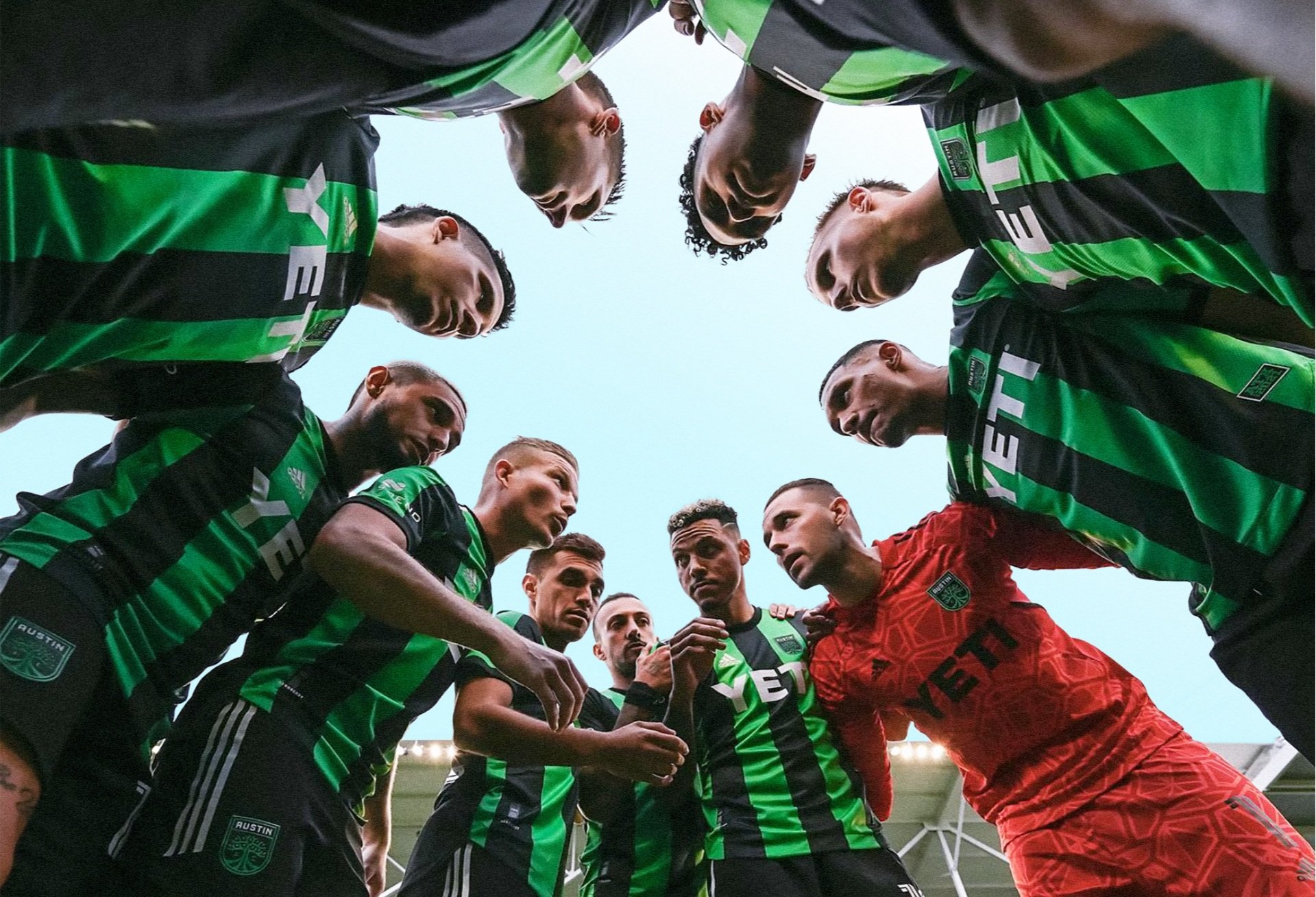
We set out to create a brand everyone could get behind. And after just one season, the club was #1 in MLS merchandise sales, sold out every single home game and was voted 2nd as the brand that best represents Austin.
SERVICES
Blitz
Strategy & Positioning
Naming
Visual Identity
Narrative
Audience Listening
Brand Launch


THE NAME
Austin FC might seem like a simple name, but it was the product of a comprehensive naming process where we explored all the different types of names common in American professional sports and global football. We then shared a few with Austinites. Some of the name options that were most liked also had strong dislikes. Austin FC won out because it was the most inclusive. It’s just the city name, so it let people attach their own meaning to it. It meant whatever Austin meant to them. And it was the first step in creating a brand everyone could see themselves in.
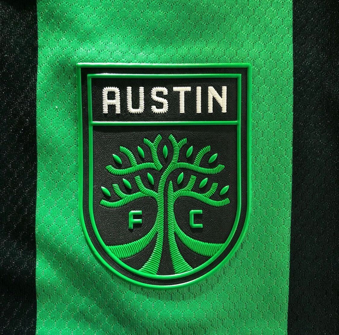

THE BADGE
In soccer, the badge is the primary visual identity. And they are filled with meaning and story. So what would our story be? It had to be unique in MLS but also feel true and familiar to people who live here. The live oak just made sense. They’re found in every part of the city. Some are over 500 years old, so they represent the city’s past and its future. They’re a symbol of strength and resilience. Austin also takes pride in being an outsider. And what’s more counterculture than having a sports team that’s a tree?

LEFT | Treaty Oak, 1930s RIGHT | Treaty Oak, 2016 w/ arborists & 2nd tree
DIGGING FOR MORE MEANING
Live oaks are found in many places throughout the South. How do we make it even more Austin? We found inspiration in a true crime podcast that told the story of the poisoning of Austin’s oldest and most famous tree, The Treaty Oak. It’s a story everyone who grows up here knows about. But we learned something new from the podcast—how arborists saved it. Live oaks share resources by connecting through their root systems. And so arborists planted another tree next to it. This is why the tree in the badge is actually two trees intertwined together.

STANDING OUT IN TEXAS | The landscape of Texas sports teams is filled with stars, cattle and a lot of red and blue. But Austin isn’t like the rest of Texas and we made sure the identity avoided all those typical tropes.


COLORS
We chose a very vibrant green to reflect the energy of the city and to also differentiate it from other greens used by other major league sports teams. Black offers a great contrast and also brings in a little competitive edge.
We named our green, Bright Verde. This was a very purposeful nod to the city’s Spanglish culture, where both languages are woven into the local lexicon. Driven by the supporters and the club, “Verde” has now grown to become a nickname for the team and a big part of its culture.


BRAND LAUNCH
Three years before a game would be played, we helped kick things off with a film to announce the name, identity and colors at their brand launch event. Adam and Marty even got on stage with representatives from the club to publicly unveil the brand for the first time.
NARRATIVE
How do you make a tree feel more sporty? One way we did that was through language. We wrote a brand story that culminated with the bold rallying cry—Grow the legend. The line is active and an invitation to supporters to be a part of building something great. And it set the tone for the club’s big ambitions and future communications.


BRAND BUILDING | This line provides the foundation for the brand’s tone and vision, and is integrated throughout the stadium and training facilities.

EXPRESSIONS
Since the initial launch, we’ve also worked with the club’s internal marketing team at critical moments to help them expand the ways they express the brand. This included helping them build out their brand toolkit in the ramp up to their inaugural season—where we added new typography and graphic treatments to support their growing communication needs.

“Lorem ipsum dolor sit amet, consectetur adipiscing elit, sed do eiusmod tempor incididunt ut labore et dolore magna aliqua.”
ANTHONY PRECOURT, Majority Owner & CEO of Austin FC


PEOPLE
THERE’S NO “I” IN BRAND | We worked with Owner Anthony Precourt, President Andy Loughnane and a diverse cross-section of locals from every part of the city and all along the soccer spectrum.