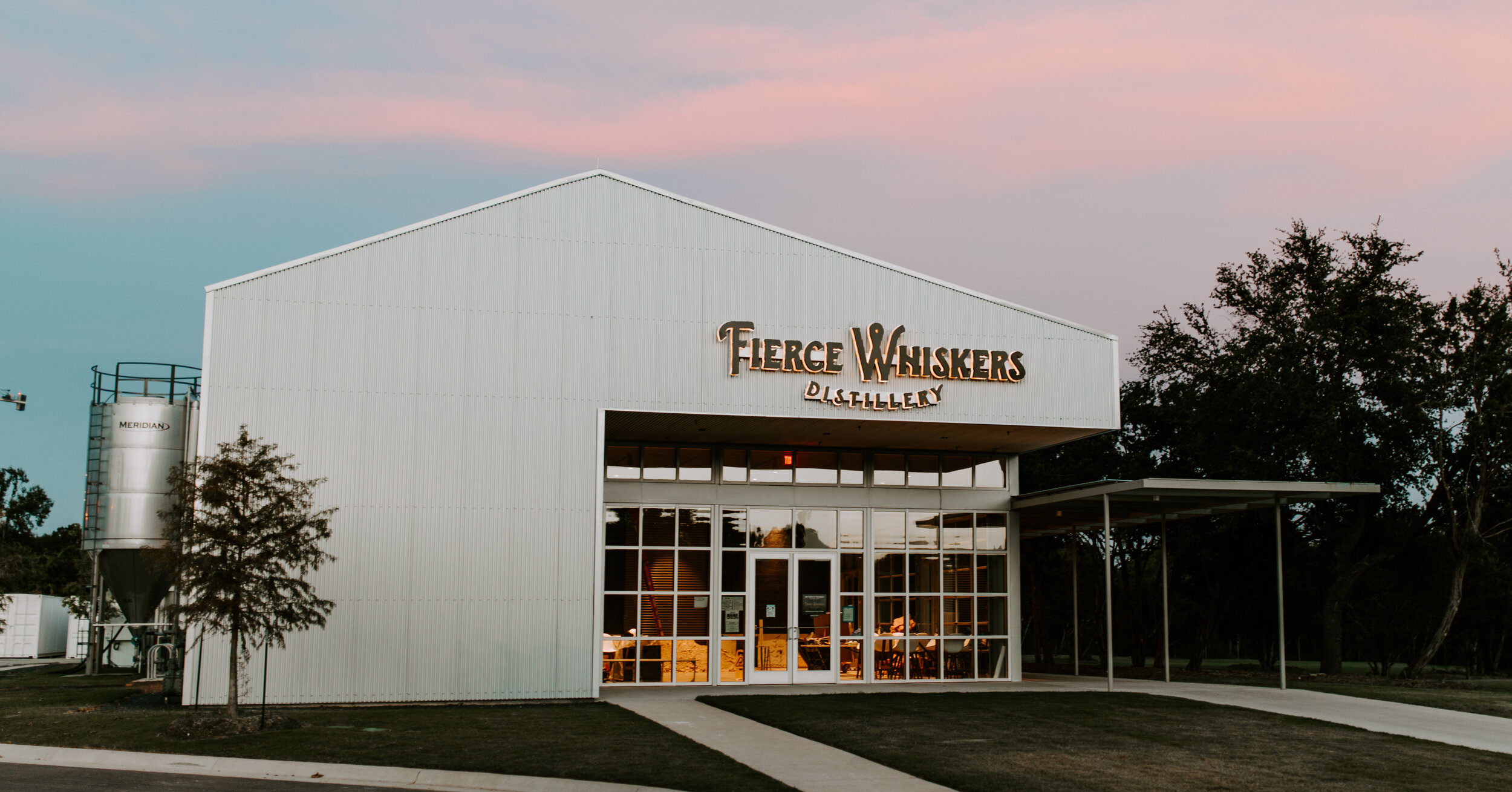
FIERCE WHISKERS
Raising a spirit.
Some say it’s impossible to properly age whiskey in the Texas heat. We worked with a group of entrepreneurs determined to do just that and make a world-class bourbon in Austin. They needed a brand to bring their vision to life. The name, found in an obscure journal entry Rutherford B. Hayes penned while visiting Austin in 1849, spoke to the defiant spirit of the city and the “large expectations” of the new distillery. Rutherford’s words inspired the period look and drove the whole visual design of the brand—from logo to website to custom bottle form.
Strategy & Positioning
Naming
Narrative
Visual Identity
Packaging


NAME INSPIRATION
How do you compete with some of the best whiskeys in the world, many of which have stories that go back centuries? Since the intention of the distillery was to be proud of being from Austin, rather than run away from it, we mined the history of the city itself for inspiration and turned a dis from a former president into branding gold.